Welcome to the third in a new series of Guest Posts from museum lovers around the world! Each post is like a mini-tour with an expert on a museum topic they’re excited about. So let’s get to know our guide:

Meet Nicole Budrovich
Nicole Budrovich is a curatorial assistant in the Antiquities Department at the J. Paul Getty Museum in Los Angeles. She is interested in the art of ancient Roman interiors (especially mosaic floors) and the history of collecting.
As the weeks of working from home stretch on, I’ve become keenly aware of the art decorating my apartment. I haven’t started talking to the paintings on the walls (there’s still time), but I have enjoyed reflecting on why I’ve held onto various posters, prints, and drawings, and more importantly, what has made them worthy of display. It’s a question I so often ask of the ancient world—why would a first-century Roman want a certain mosaic or fresco for their dining room or reception hall? What might the work tell us about the room’s use, the (projected?) identity of the homeowner, the fashions of the times, or the supplies of artisan workshops? So, what do my walls say about a museum professional and art-enthusiast living in Los Angeles in the early twenty-first century? If you are at home, take a look around—what insights might your surroundings offer?
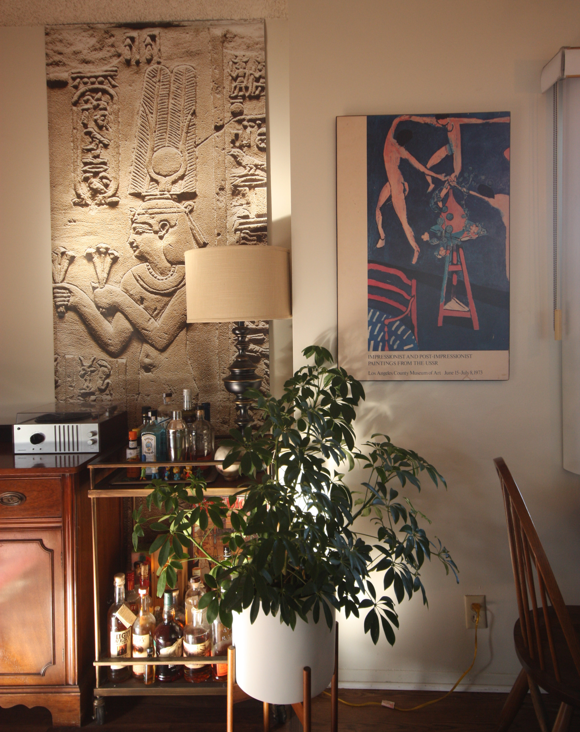
First stop, the living room! A space for hosting gatherings in the before times, the walls are decorated with artsy works, but nothing too shocking for more a conservative visitor (i.e. not too much nudity). Behind our drink cart hangs the fabulous street banner from the Getty’s 2018 exhibition “Beyond the Nile: Egypt and the Classical World,”Cleopatra II (or III) is bedecked with a magnificent crown and makes an offering. I love how the banner fills the wall like a true relief, with Cleopatra presiding over our modern libations.
Just adjacent is an even older exhibition relic—a 1973 poster from the blockbuster show of Impressionist and Post-Impressionist Paintings from the USSR. Besides pairing nicely with the banner, this poster has a nostalgic tug since my parents have had an identical print in our living room for as long as I can remember. In 1973 my mom and dad had only just started dating, and they decided to drive from San Francisco to LA for a spontaneous weekend trip. The exhibition was my mom’s suggestion—my dad was keen on the Anheuser-Busch factory tour—but he fell in love with the show and they visited a second time (they never made it to the beer factory). Forty years later, my sister found this poster in a Berkeley thrift shop, on sale for $4.25!
Turn around and there’s another Getty exhibition street banner: Jackson Pollock’s Mural from the 2014 show. Kudos to the Getty design team for filling the banner with this life-size crop of the original, letting the high res photography pop (the Getty still sells old banners, well-worth checking out). From my work-from-home desk, I’ve had lots of time to enjoy its bold brush strokes and paint splatter. In the before times, a guest even asked if it’s “real”—a favorite question about art reproductions, because of course, “yes and no.”
Next to it hangs an original copy of sorts, Pizza in Gold, my riff on Gustav Klimt’s Portrait of Adele Bloch-Bauer, which I made in 2017 for a bi-annual art contest held by Zachary’s Pizza (notice the nimbus-like pizza behind the sitter). A Berkeley institution, Zachary’s was a mainstay of my college years, and in the years since, has become an essential part of every Budrovich-family Bay Area trip. After two years on display, a new batch of paintings were selected, so I was thrilled to reclaim it this past January. Now in my living room, it signals potential guests that I’m worldly and artsy, but also a bit silly (and a loyal fan of Zachary’s Pizza).
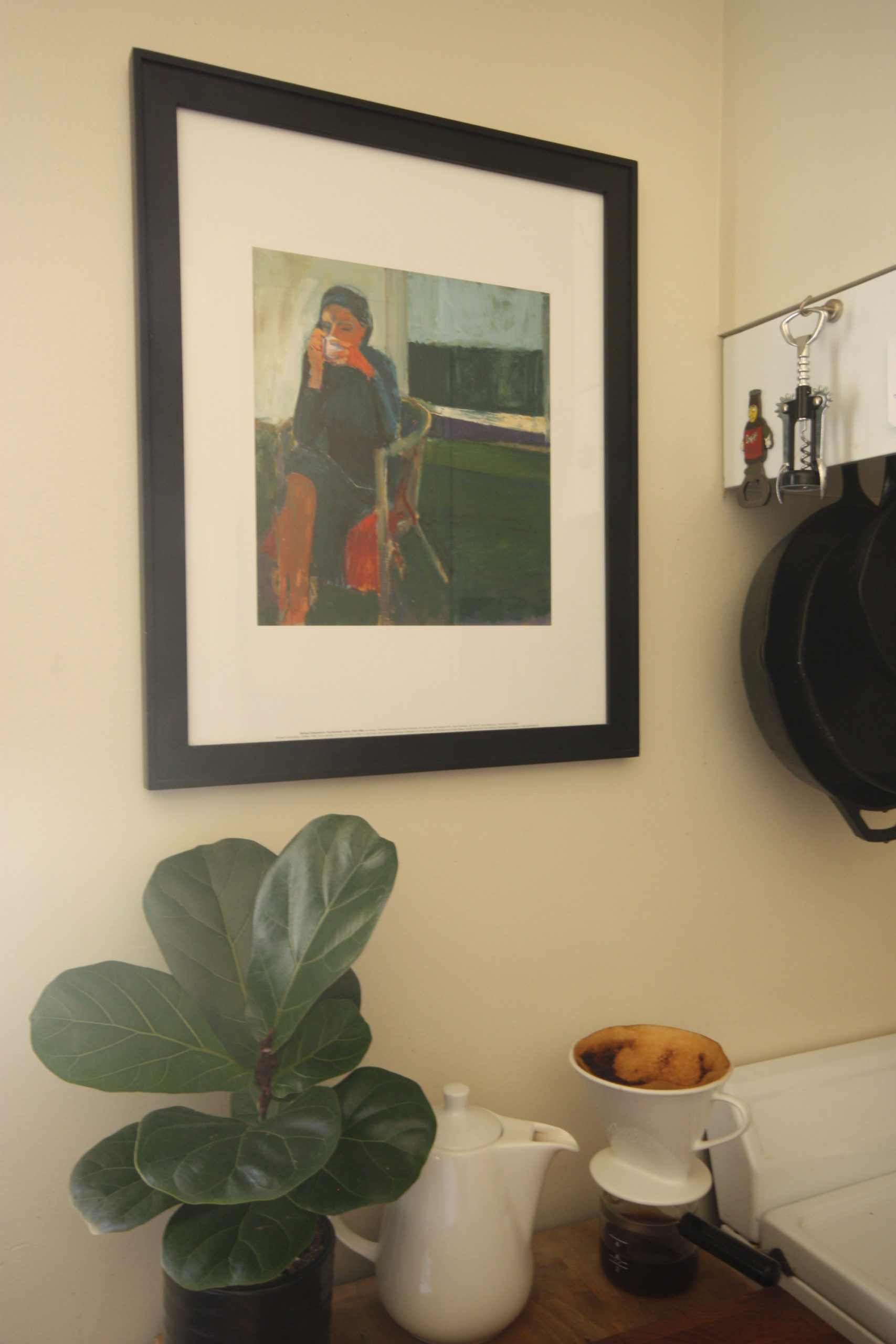
We’ll make a quick stopover in the kitchen where this print of a Woman Drinking Coffee hangs over—you guessed it—coffee-making accoutrements. The original painting fills a wall (over four feet square), but this small print still conveys the space and quiet calm of morning coffee. I picked it up at an exhibit in San Francisco in 2013, my first encounter with the artist Richard Diebenkorn. Since then, I’ve fallen in love with his work, beautiful studies of composition and light.
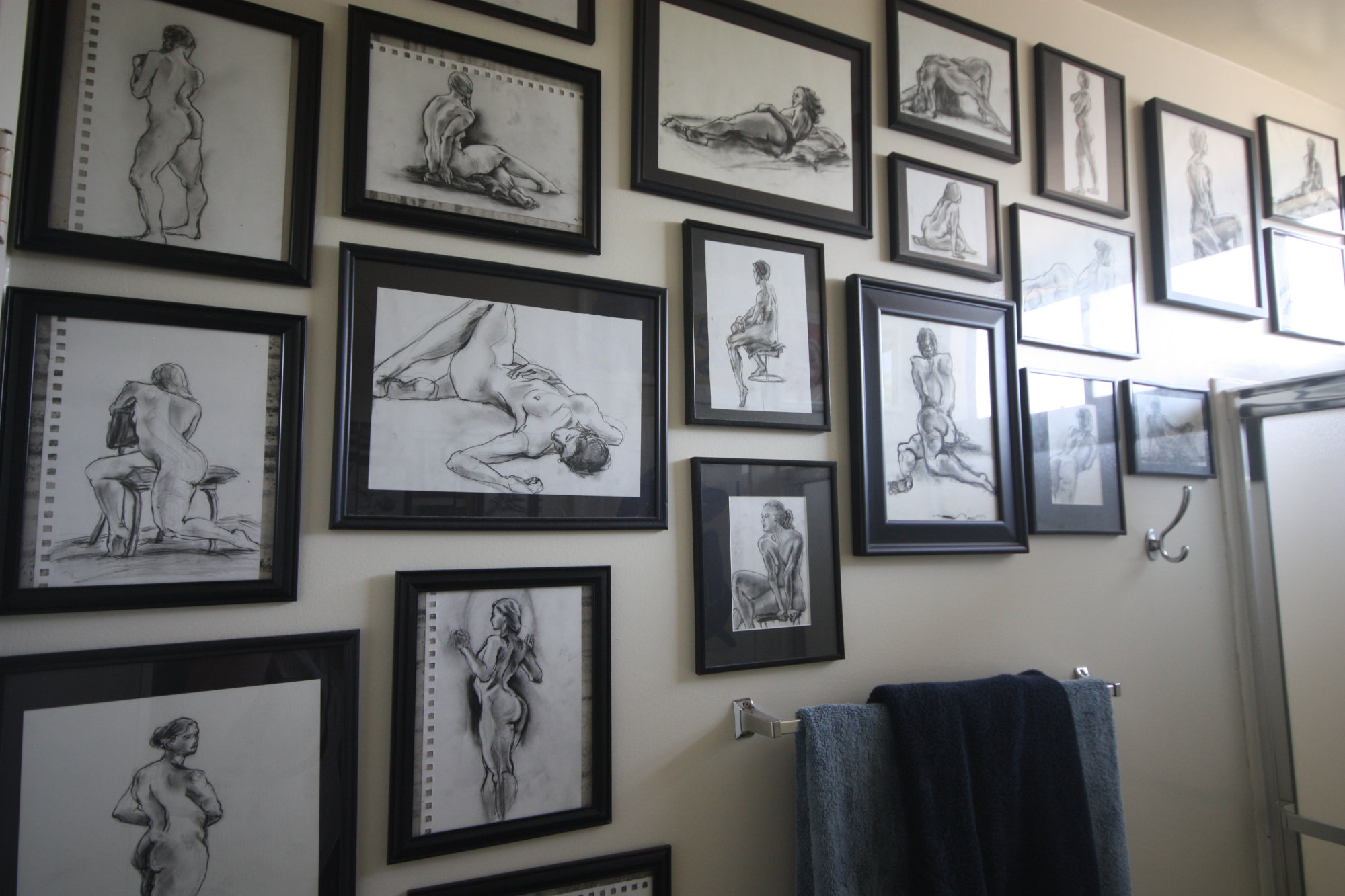
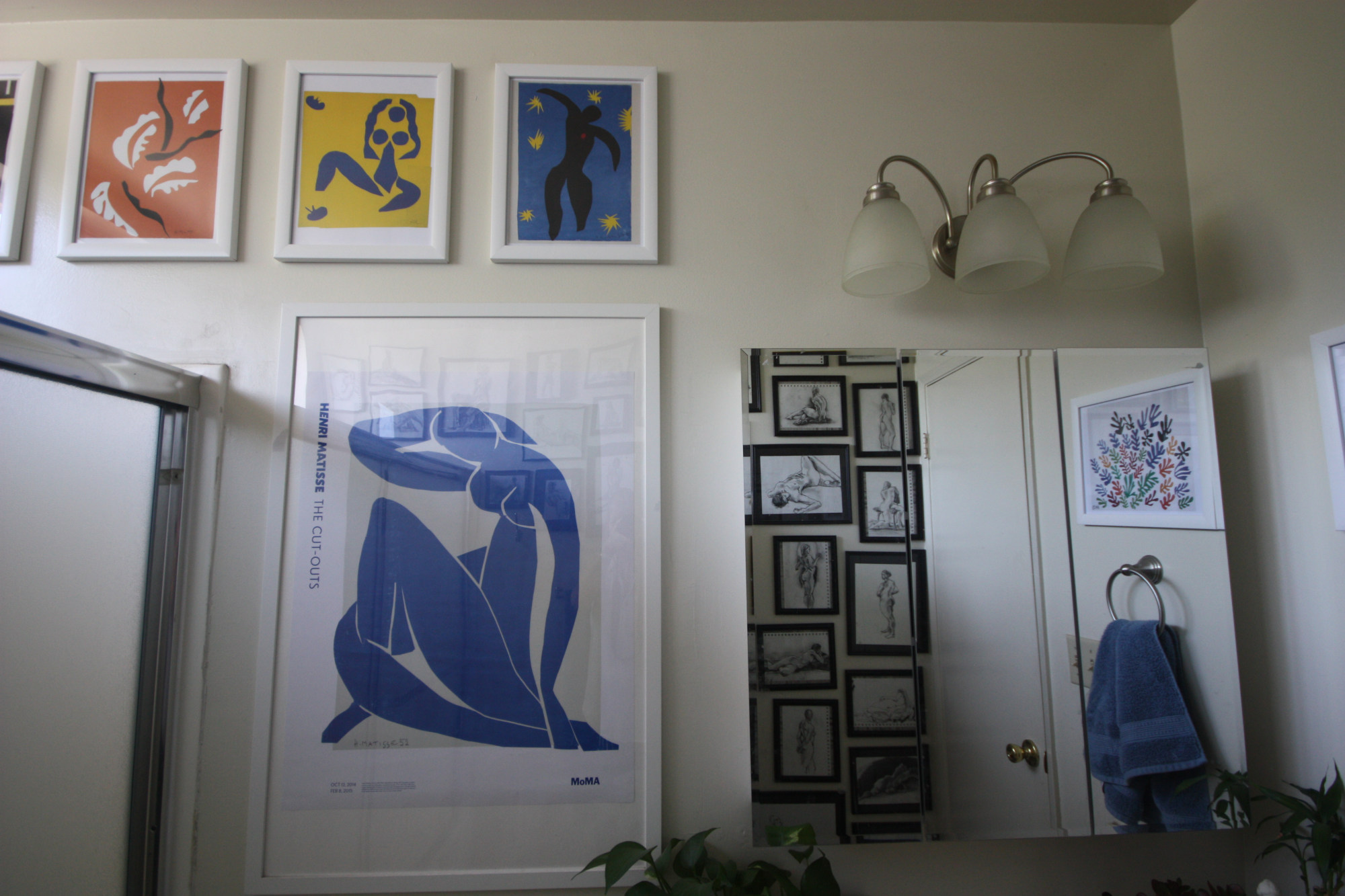
Our final stop is an intimate space, perhaps my favorite art spot in the apartment—the bathroom! For me, it has always seemed a natural location for art—a separate room of getting ready, winding down, and solitary moments. For guests, it’s a room you visit alone (obviously), and something about that privacy makes it a perfect place to showcase tasteful nudes. Our so-called “naked lady wall” has over two dozen sketches, a mix of my sister’s and mine, all drawn from live models (thank you UC Berkeley for hosting the most amazing and affordable life drawing group, aka my church). And on the opposing wall hang prints of Matisse’s cutouts (and another exhibition poster from the MoMA’s incredible 2015 show). It’s no wonder these celebrations of colors, bodies, and forms are still so popular.
A bonus stop! The wonderful (or terrifying?) world of the Zoom virtual background. If a room’s decoration might be a chance mix of nostalgia, aesthetics, and self-advertisement, the backgrounds we arrange or select for video calls are explicitly about a projected identity for a specific audience. With the rise of video calls, our private spaces are suddenly on public (or at least professional) display. As much as I love my apartment’s décor, I prefer the privacy (and playfulness!) of virtual backgrounds. In the past few weeks I’ve been using photos of artist studios, starting with Cezanne’s atelier in Aix-en-Provence and more recently those of Matisse and Monet (with more to come). Perhaps hoping to connect, in some abstract digital way, with these very real spaces of creativity.
Like this Angelino #athome art tour? Share your thoughts in the comments section below or via the Contact page!
All photos kindly provided by Nicole Budrovich.


