Artist Documentaries: Dali, Monet, El Greco
Some great, free, online documentaries about artists have got me thinking about museums in these Corona times. They are a pretty low-tech way (remember television?) to experience some of what we love about museums while we continue, on the whole, to #museumfromhome. Some online museum resources are fun, while others are not much to get excited about. These documentaries seem to me a great quasi-substitute for not only museum visits themselves, but an array of cultural offerings that are lacking right now: things like film screenings, lectures, and art galleries. One in particular really revved me up – I think you’ll like it too!
Salvador Dali: A Master of the Modern Era (MIKOS ARTS)
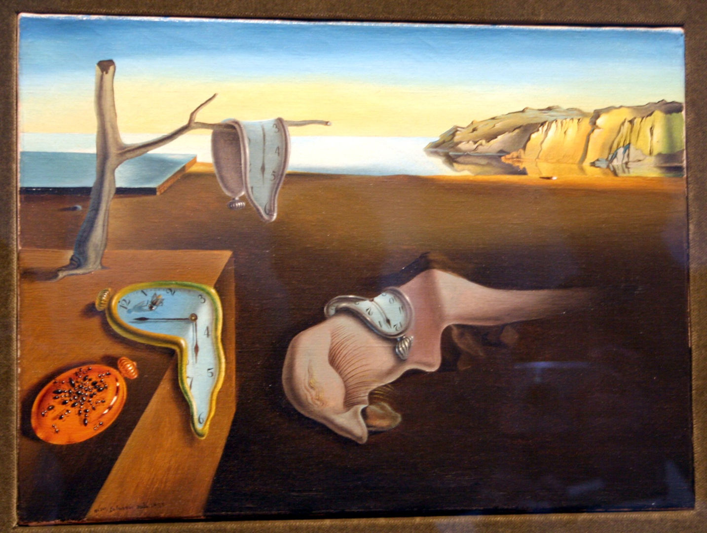
This is an absolutely delightful look at an artist that I, for one, had fully underestimated. Everyone knows the melting clocks, but what this documentary made clear to me for the first time is the impact that Dali’s art had before it became a cliche. Its connection to his own life – the rocky landscape where he lived, his own dreams and nightmares – was also new to me. And Dali’s breakthrough in Hollywood! Other artists began to reject him as he started to embrace pop culture. Indeed, he helped make pop culture what it is today. This is all told by the bright and charming Alastair Sooke on site at some of the locations in Dali’s personal history, as well as in museums in front of Dali’s paintings. I can’t wait to watch the Picasso episode of the same series!
This is of course great motivation to finally visit the Dali museum in Berlin. Stay tuned…
One mind-expanding artist documentary was I, Claude Monet by Exhibition on Screen (a company to keep an eye on – they make great stuff), which you can buy or rent over the website. I don’t know about you, but I had the wrong impression about this guy. I turns out that those happy sailboats and seaside scenes now used on feel-good products like calendars and greeting cards came out of very dark circumstances. Poor Monet was desperately poor for most of his life, and suffered greatly at the loss of his wife – from hunger and lack of medical care due to extreme poverty – and multiple children. In addition, he was not much appreciated during his lifetime; in a letter to his galerist, Monet once wrote that at least when his art was being excoriated, it was being talked about! – better than being ignored, as it was for a long time. This documentary is narrated purely from Monet’s own letters, voiced with heart-rending emotion by a great voice actor. You’ll never look at a Monet the same way, I promise.
Another free online documentary on my list is El Greco: An Artist’s Odyssey. Narrated by Adrien Brody, what’s not to love? It’s one of many videos in the National Gallery of Art’s Vimeo channel – check it out!
Have you found a good artist documentary too? Let us know in the comments section below or through the Contact page!
Guest Post Los Angeles! Nicole Budrovich shows us her art at home
Welcome to the third in a new series of Guest Posts from museum lovers around the world! Each post is like a mini-tour with an expert on a museum topic they’re excited about. So let’s get to know our guide:

Meet Nicole Budrovich
Nicole Budrovich is a curatorial assistant in the Antiquities Department at the J. Paul Getty Museum in Los Angeles. She is interested in the art of ancient Roman interiors (especially mosaic floors) and the history of collecting.
As the weeks of working from home stretch on, I’ve become keenly aware of the art decorating my apartment. I haven’t started talking to the paintings on the walls (there’s still time), but I have enjoyed reflecting on why I’ve held onto various posters, prints, and drawings, and more importantly, what has made them worthy of display. It’s a question I so often ask of the ancient world—why would a first-century Roman want a certain mosaic or fresco for their dining room or reception hall? What might the work tell us about the room’s use, the (projected?) identity of the homeowner, the fashions of the times, or the supplies of artisan workshops? So, what do my walls say about a museum professional and art-enthusiast living in Los Angeles in the early twenty-first century? If you are at home, take a look around—what insights might your surroundings offer?
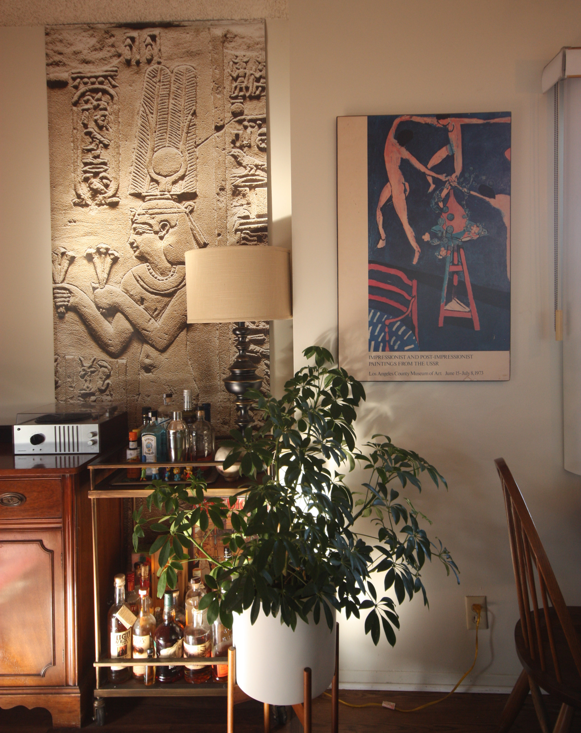
First stop, the living room! A space for hosting gatherings in the before times, the walls are decorated with artsy works, but nothing too shocking for more a conservative visitor (i.e. not too much nudity). Behind our drink cart hangs the fabulous street banner from the Getty’s 2018 exhibition “Beyond the Nile: Egypt and the Classical World,”Cleopatra II (or III) is bedecked with a magnificent crown and makes an offering. I love how the banner fills the wall like a true relief, with Cleopatra presiding over our modern libations.
Just adjacent is an even older exhibition relic—a 1973 poster from the blockbuster show of Impressionist and Post-Impressionist Paintings from the USSR. Besides pairing nicely with the banner, this poster has a nostalgic tug since my parents have had an identical print in our living room for as long as I can remember. In 1973 my mom and dad had only just started dating, and they decided to drive from San Francisco to LA for a spontaneous weekend trip. The exhibition was my mom’s suggestion—my dad was keen on the Anheuser-Busch factory tour—but he fell in love with the show and they visited a second time (they never made it to the beer factory). Forty years later, my sister found this poster in a Berkeley thrift shop, on sale for $4.25!
Turn around and there’s another Getty exhibition street banner: Jackson Pollock’s Mural from the 2014 show. Kudos to the Getty design team for filling the banner with this life-size crop of the original, letting the high res photography pop (the Getty still sells old banners, well-worth checking out). From my work-from-home desk, I’ve had lots of time to enjoy its bold brush strokes and paint splatter. In the before times, a guest even asked if it’s “real”—a favorite question about art reproductions, because of course, “yes and no.”
Next to it hangs an original copy of sorts, Pizza in Gold, my riff on Gustav Klimt’s Portrait of Adele Bloch-Bauer, which I made in 2017 for a bi-annual art contest held by Zachary’s Pizza (notice the nimbus-like pizza behind the sitter). A Berkeley institution, Zachary’s was a mainstay of my college years, and in the years since, has become an essential part of every Budrovich-family Bay Area trip. After two years on display, a new batch of paintings were selected, so I was thrilled to reclaim it this past January. Now in my living room, it signals potential guests that I’m worldly and artsy, but also a bit silly (and a loyal fan of Zachary’s Pizza).
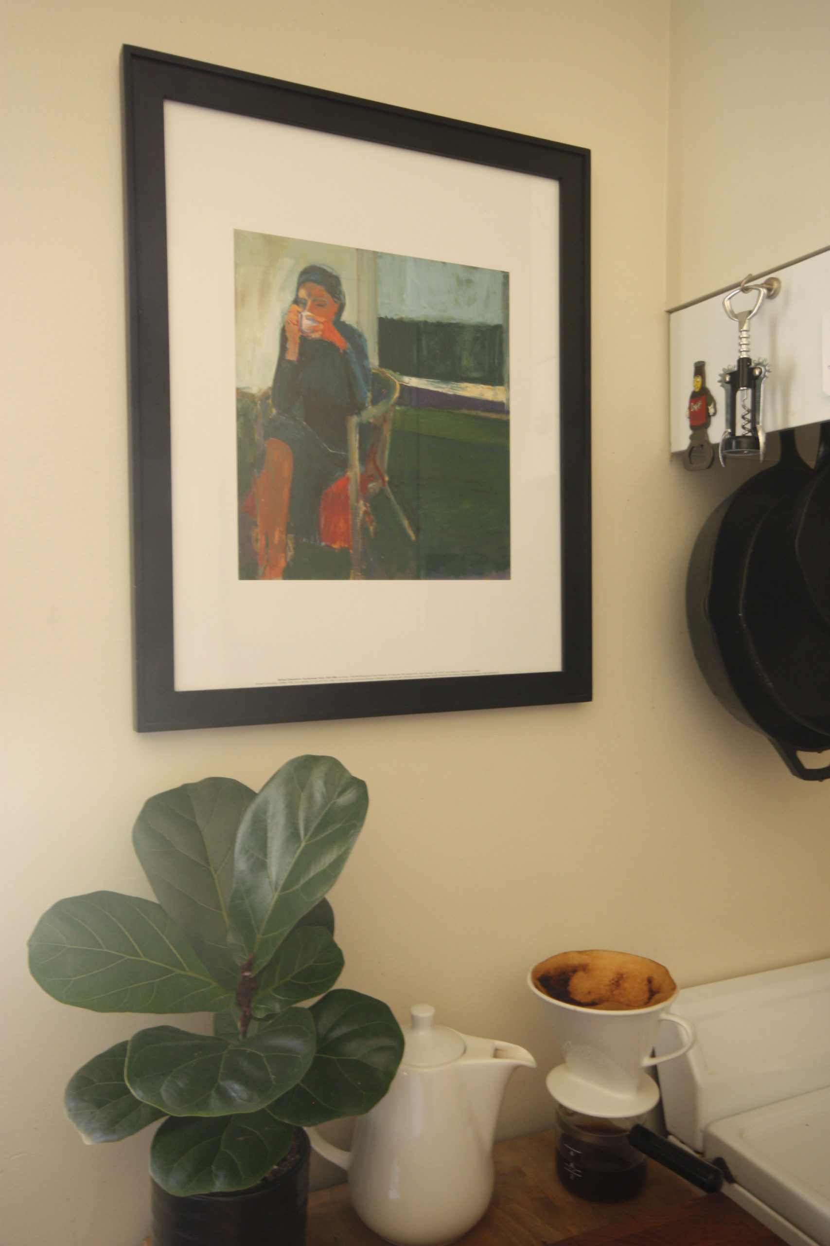
We’ll make a quick stopover in the kitchen where this print of a Woman Drinking Coffee hangs over—you guessed it—coffee-making accoutrements. The original painting fills a wall (over four feet square), but this small print still conveys the space and quiet calm of morning coffee. I picked it up at an exhibit in San Francisco in 2013, my first encounter with the artist Richard Diebenkorn. Since then, I’ve fallen in love with his work, beautiful studies of composition and light.
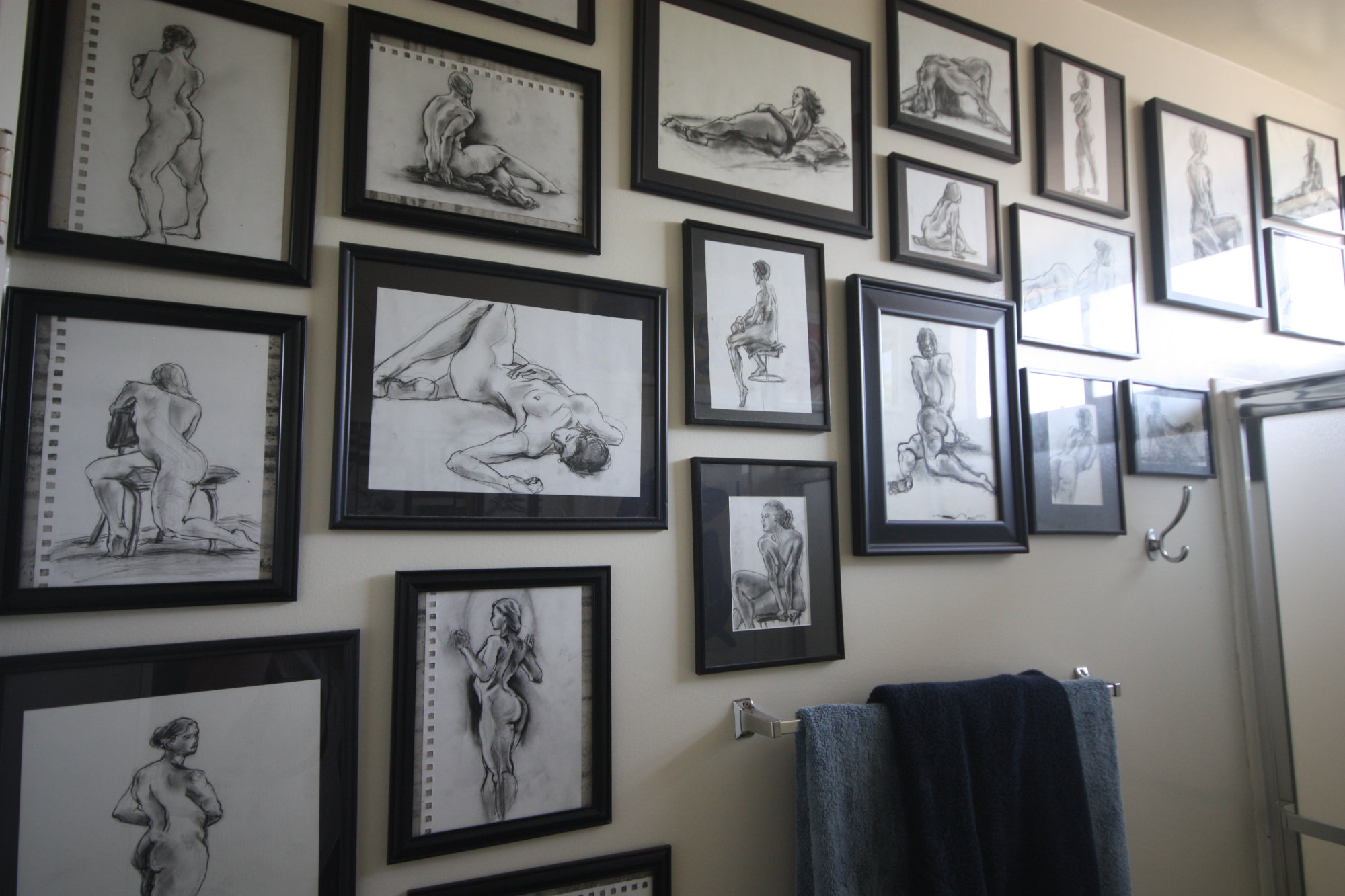
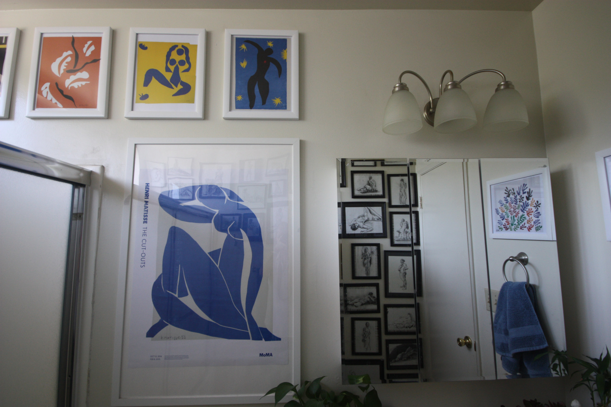
Our final stop is an intimate space, perhaps my favorite art spot in the apartment—the bathroom! For me, it has always seemed a natural location for art—a separate room of getting ready, winding down, and solitary moments. For guests, it’s a room you visit alone (obviously), and something about that privacy makes it a perfect place to showcase tasteful nudes. Our so-called “naked lady wall” has over two dozen sketches, a mix of my sister’s and mine, all drawn from live models (thank you UC Berkeley for hosting the most amazing and affordable life drawing group, aka my church). And on the opposing wall hang prints of Matisse’s cutouts (and another exhibition poster from the MoMA’s incredible 2015 show). It’s no wonder these celebrations of colors, bodies, and forms are still so popular.
A bonus stop! The wonderful (or terrifying?) world of the Zoom virtual background. If a room’s decoration might be a chance mix of nostalgia, aesthetics, and self-advertisement, the backgrounds we arrange or select for video calls are explicitly about a projected identity for a specific audience. With the rise of video calls, our private spaces are suddenly on public (or at least professional) display. As much as I love my apartment’s décor, I prefer the privacy (and playfulness!) of virtual backgrounds. In the past few weeks I’ve been using photos of artist studios, starting with Cezanne’s atelier in Aix-en-Provence and more recently those of Matisse and Monet (with more to come). Perhaps hoping to connect, in some abstract digital way, with these very real spaces of creativity.
Like this Angelino #athome art tour? Share your thoughts in the comments section below or via the Contact page!
All photos kindly provided by Nicole Budrovich.
Guest Post Istanbul! Jaimee Comstock-Skipp shows us the Sadberk Hanim Museum
Welcome to the second in a new series of Guest Posts from museum lovers around the world! Each post is like a mini-tour with an expert on a museum topic they’re excited about. So let’s get to know our guide:
Meet Jaimee Comstock-Skipp
Guest poster Jaimee Comstock-Skipp is a PhD candidate at Leiden University preferring to reside in Istanbul and Tashkent to finish up fieldwork and dissertation chapters. Her interests are in Persian-language manuscript arts produced outside of Iran, in Central Asia and the Ottoman realm.
What’s not to love about a museum occupying a late-Ottoman villa along the Bosphorus? From the ferry ride (which I hope visitors will take from the main touristy hubs of Eminonu or Besiktas ports in Istanbul), the Sadberk Hanim Museum is like the 19th-century domestic architecture that floats by as you travel up the waterway. Pastel, ice-cream colored paint jobs with white gingerbread trim makes one wonder what it might be like inside. Well! Step right in.
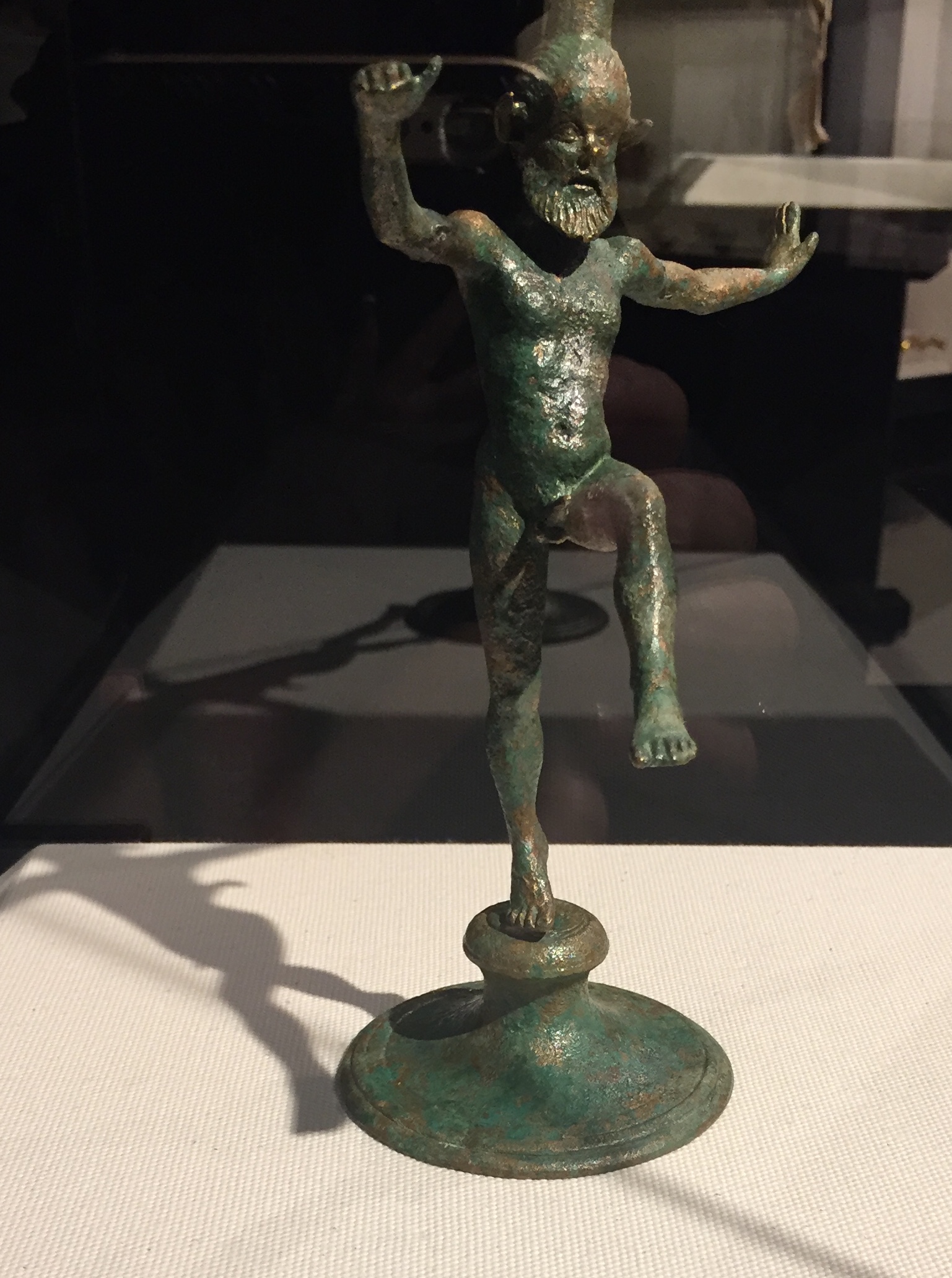
The left wing houses an archaeological collection spanning various civilizations passing through Anatolia: Neolithic/Bronze/Iran Ages through the Byzantine period. Among the highlights: a lamp in the form of a satyr from early 4th-century BC that looks like he’s about to launch into an epic kung fu battle (see illustration), eco-friendly/reusable earplugs (looking perhaps more like gilded earwax specimens; see illustration), and a wall of photographed terra cotta oil lamps with some kinky ones interspersed to hold your interest (no illustration provided for concerns of modesty).

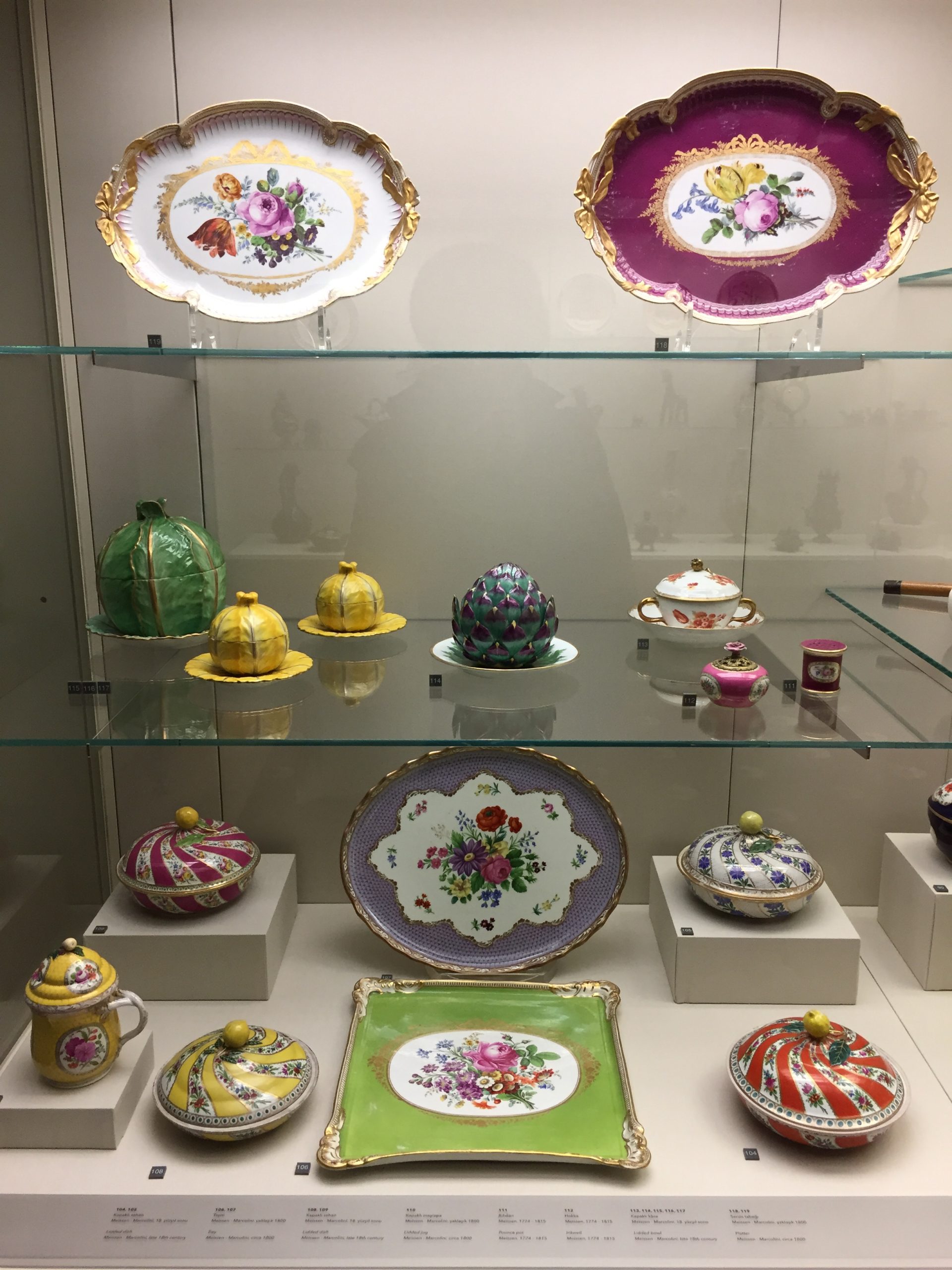
The (post-Islamic) right wing contains objects from the wealthy Koç family who once inhabited the home. Madame Sadberk herself was quite the collector, and her acquisitions give a good overview of pieces from the Islamic world across multiple dynasties and regions. Another gallery contains rows of Iznik pottery and tiles from floor to ceiling (see illustration), and around the corner is a grouping of early-19th century crockery wherein you could put a whole cabbage inside the ceramic cabbage, or an artichoke inside the glazed artichoke on display. (See the illustration for this 3-D trompe l’oeil.) When the present author visited there was a display of Ottoman velvets and brocaded robes for (petite) noble ladies. In looking at the tiles and textiles of this part of the museum wing one is struck by the ambiguity of what is of European or Asian manufacture in the 19th-century exhibits on display. They are all from the heyday of Orientalism and Chinoiserie, after all.

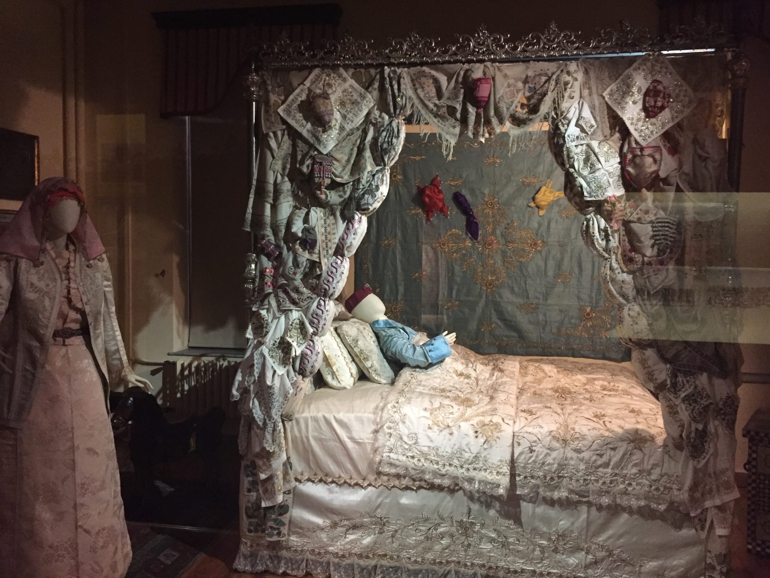
Lastly, as any Turkish school child forced to visit the museum on a class trip or interested visitor will attest, the most memorable element of the collection is the Circumcision Room complete with mannequins in period silk fashion. A small boy in blue bedclothes rests under white satin bedsheets while little bags full of money, given by wealthy guests celebrating the occasion, adorn the curtains of his bedchamber.
How about this Turkish treasure? Share your thoughts in the comments section below or via the Contact page!
All photos kindly provided by Jaimee Comstock-Skipp.
Guest Post Mexico! Caitlin McQuade shows us the International Museum of the Baroque in Puebla
Welcome to the first in a new series of Guest Posts from museum lovers around the world! Each post is like a mini-tour with an expert on a museum topic they’re excited about. So let’s get to know our guide:
Meet Caitlin McQuade
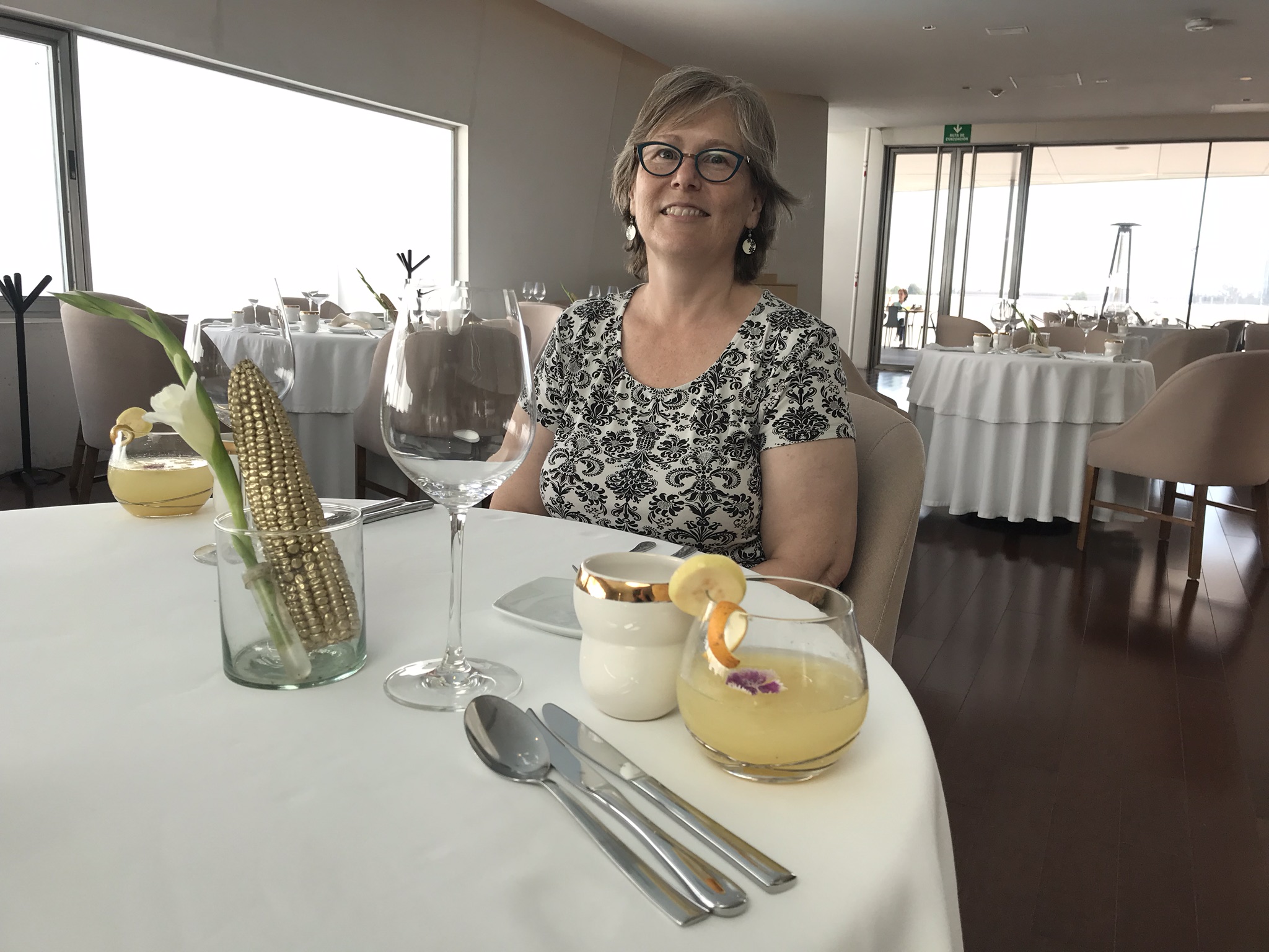
Guest poster Caitlin McQuade has worked in U.S. museums for over 30 years as an exhibit and interpretation planner. She got to spend two months in Puebla, Mexico in 2019, learning Spanish and visiting the city’s many museums. Visit her blog and say hello!
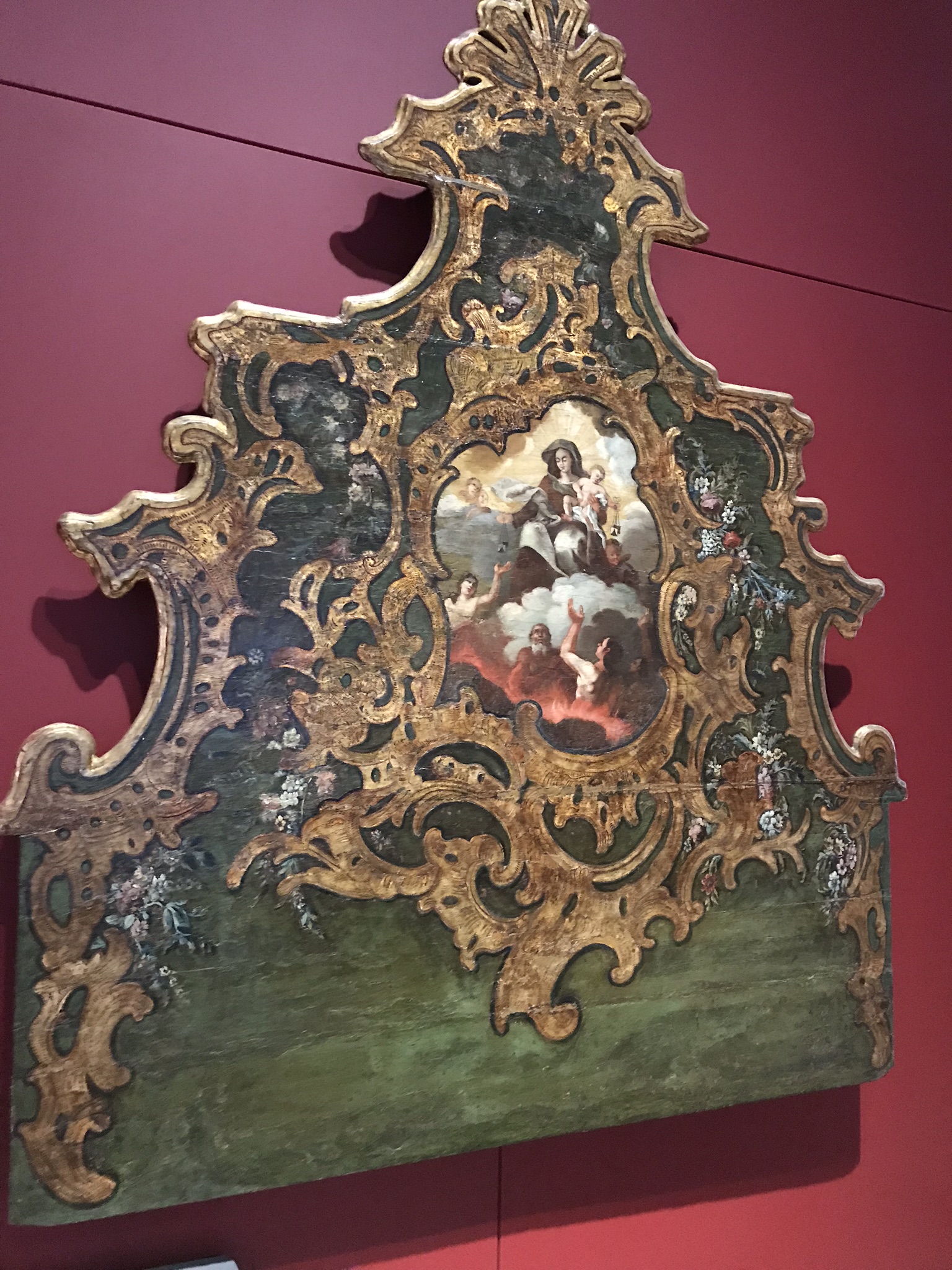
Puebla, Mexico, has a baroque heart. Built by Spanish colonists, the city’s historic facades pulse and swirl with ornament. Its well-preserved collection of 16th-18th century architecture earned the city UNESCO’s World Heritage label. And out in a new suburb of the city, a remarkable museum describes the global context for the city’s historic center.
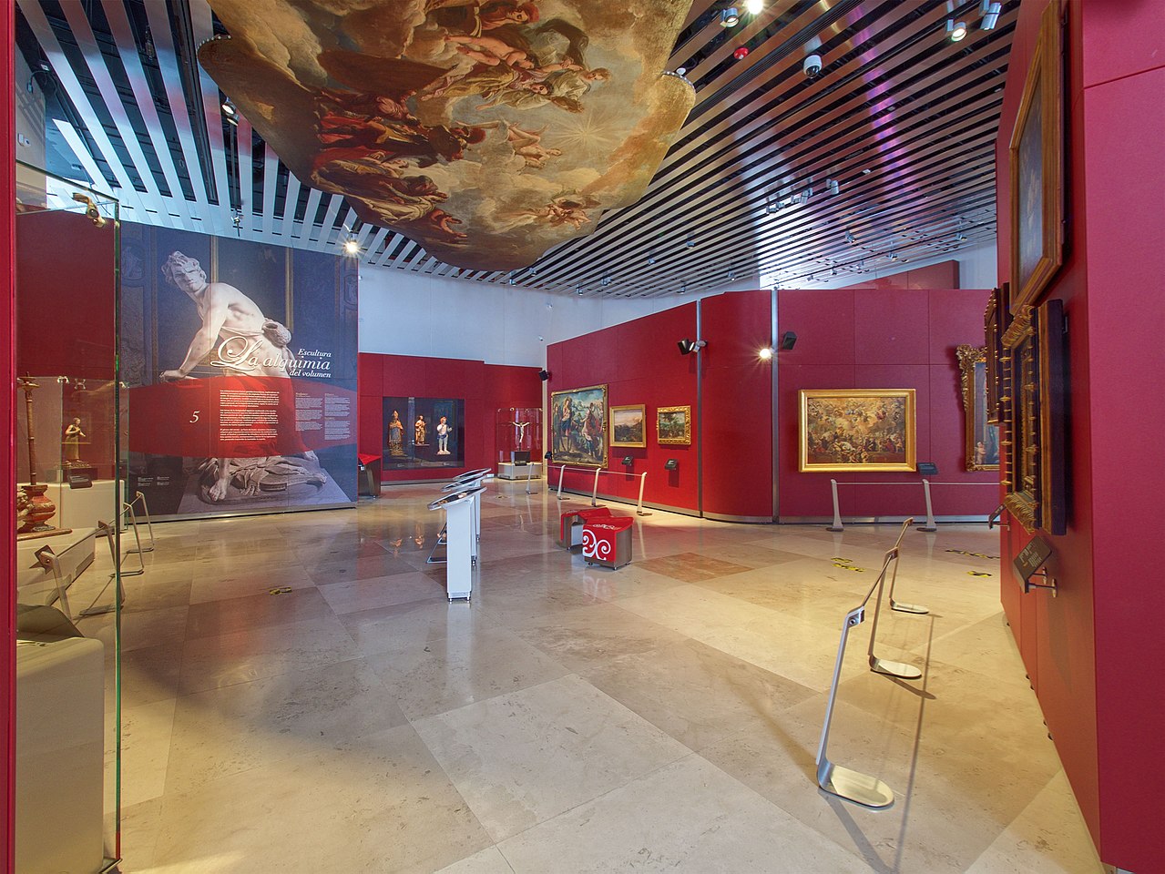
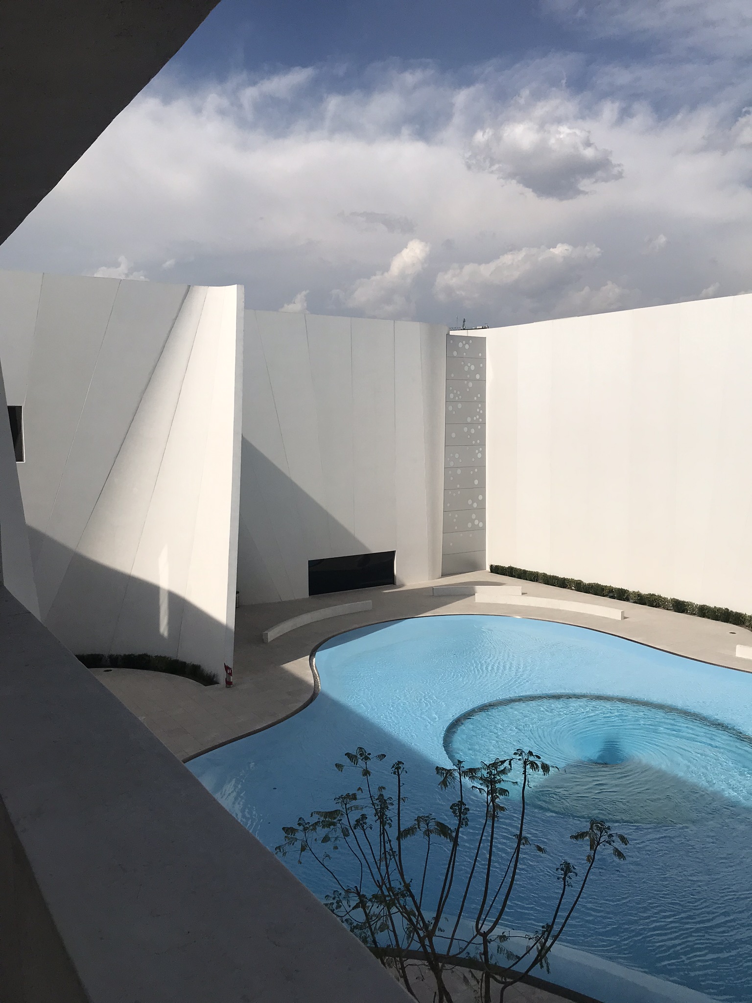
The International Museum of the Baroque interprets the style in exhibits and in the building’s design. Architect Toyo Ito lifted the Baroque idea of asymmetric curves and applied it to a contemporary plan. Curled concrete slabs swoop and tilt around the exterior. The walls inside echo this motion and rise to 20 feet (6.5 meters) high.
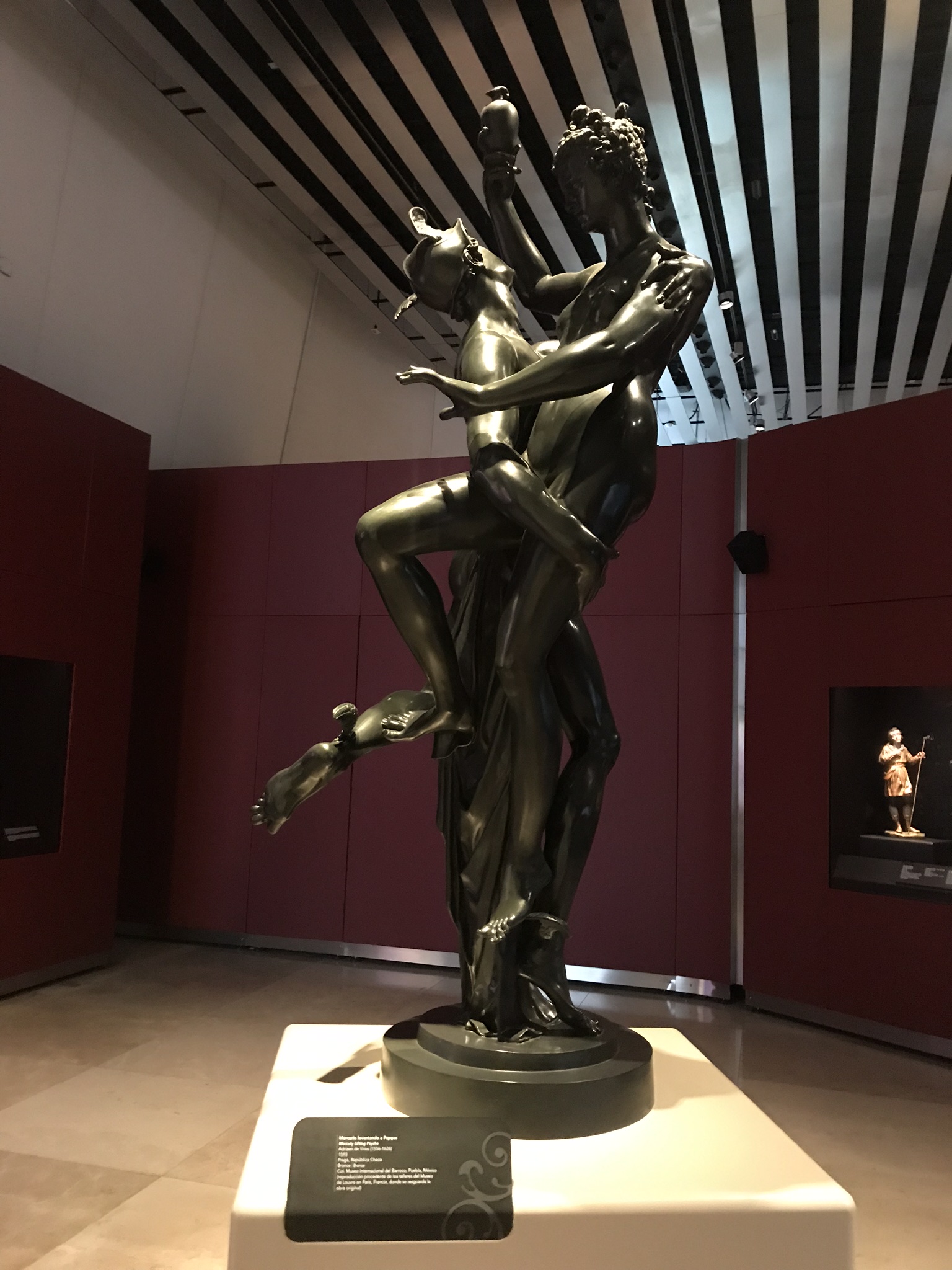
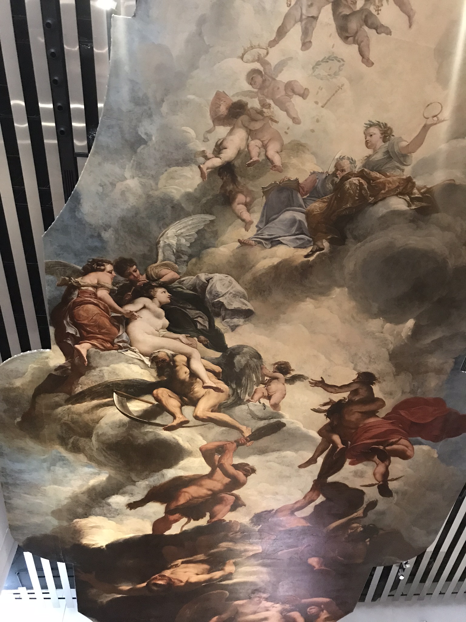
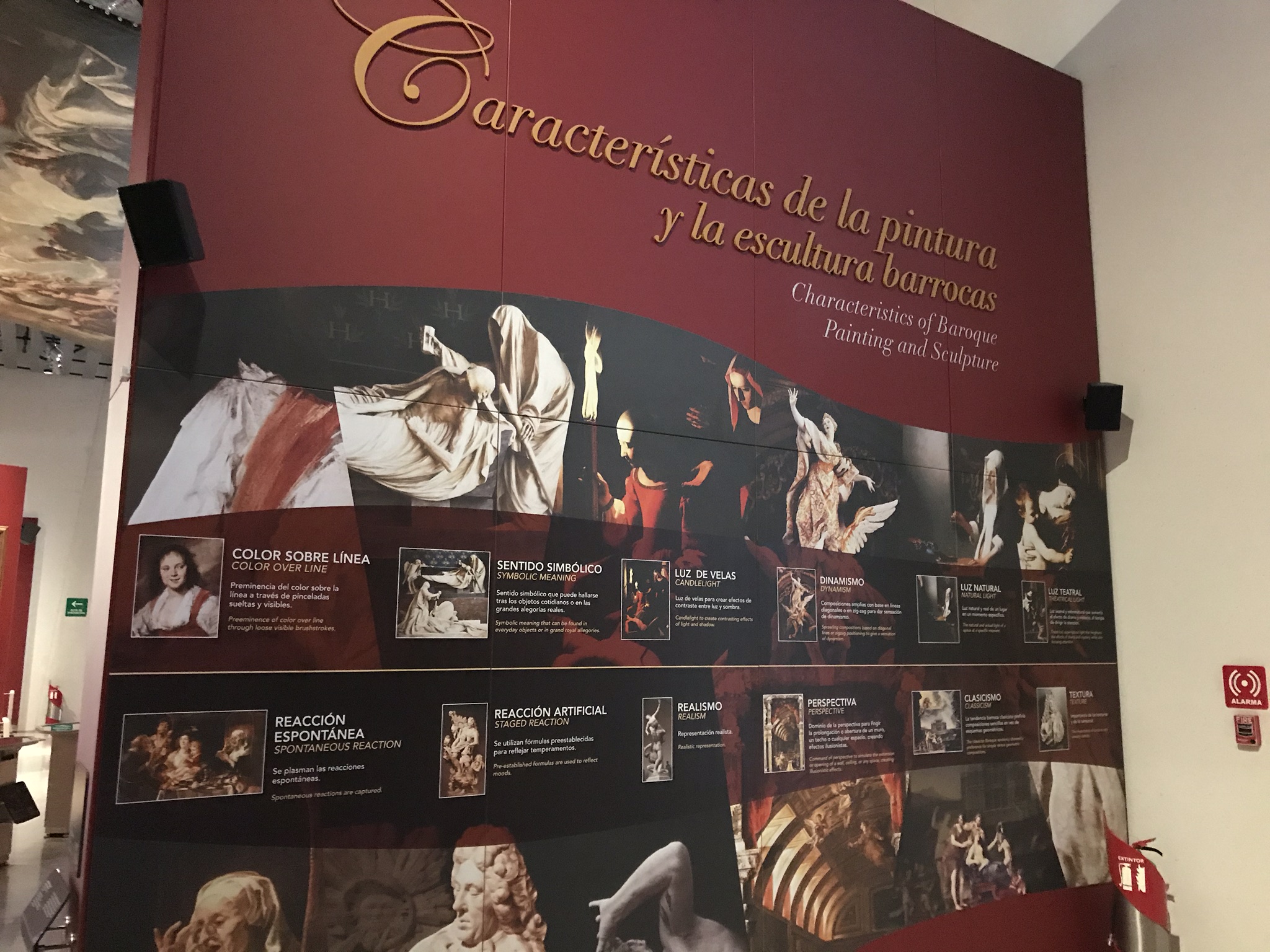
It all makes a grand setting for a grand story: the Baroque battle against restraint and reform in all the arts, across continents, for a century and a half. The Museum’s planners gathered or reproduced paintings and sculpture, religious objects, decorative arts and costumes, scientific instruments—even a ceiling!—from Europe and the Americas. In eight permanent galleries, these things demonstrate essential qualities of the Baroque: swirling motion; contrasts of light and dark; theatricality.
The exhibit planners made liberal use of digital technology. Multi-touch monitors swarm with examples of paintings from the period, and listening stations offer selections from Baroque composers.
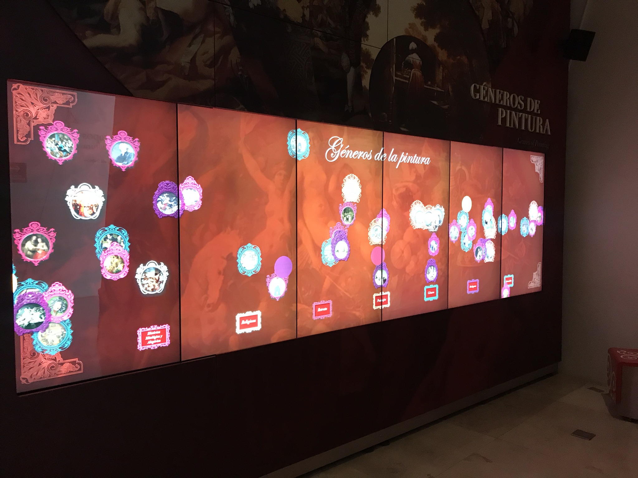
Exhibit text (always in both Spanish and English) acknowledges that European military conquest funded and spread the Baroque style. But the dire consequences to conquered people and their cultures do not appear in the Museum. The galleries effectively celebrate the period’s beauty and spectacle.
After the dramatically lit galleries, there’s refreshment in the bright and elegant restaurant, with views onto the (of course!) swirling pool in an interior courtyard. And, on returning Puebla’s center, the city feels both more historic and more contemporary: for better or worse, globalism isn’t such a new thing, after all.
How about this take on the Baroque and the modern? Share your thoughts in the comments section below or via the Contact page!
All photos kindly provided by Caitlin McQuade.


