Two Pergamon Museums in Berlin?
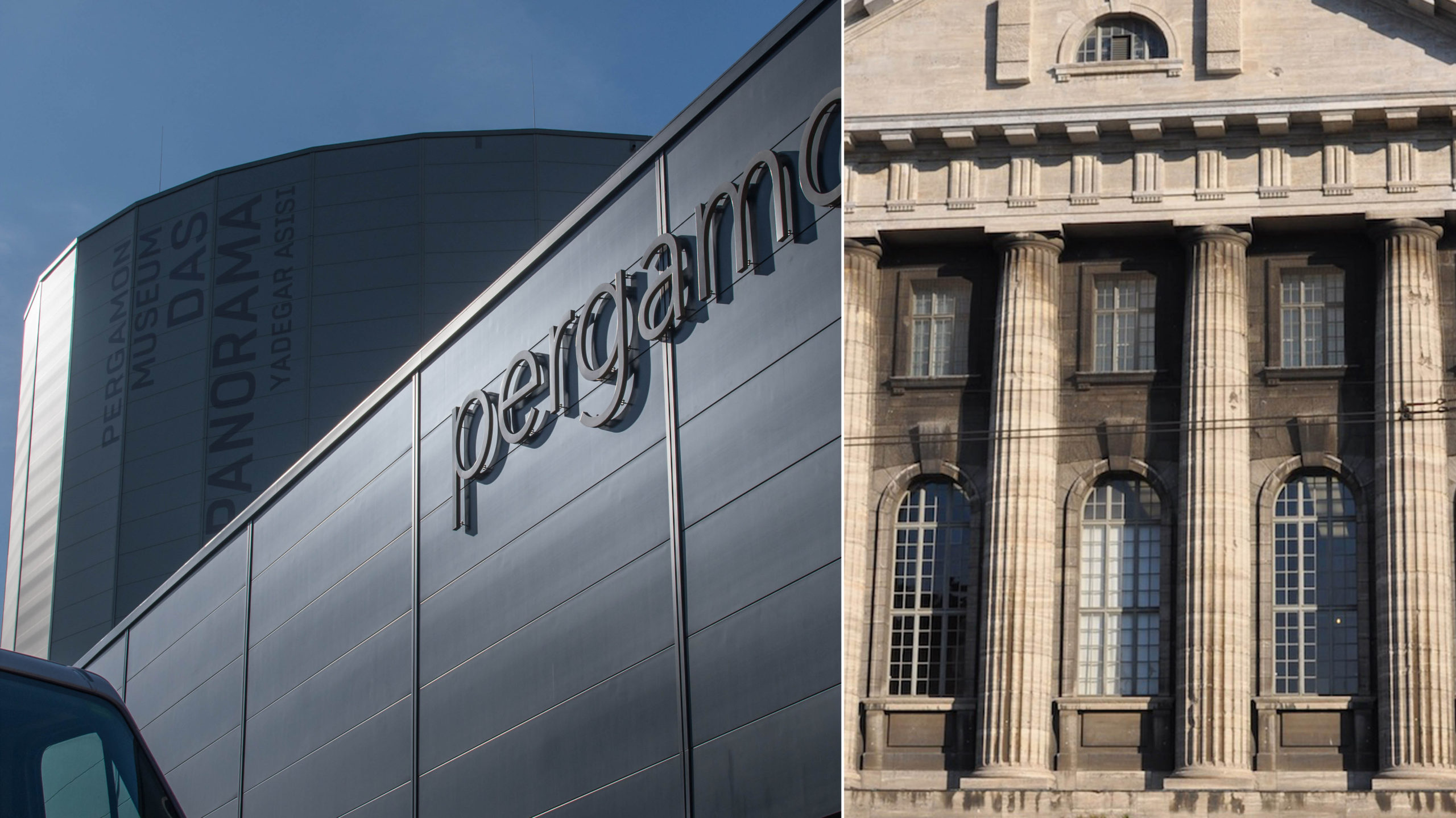
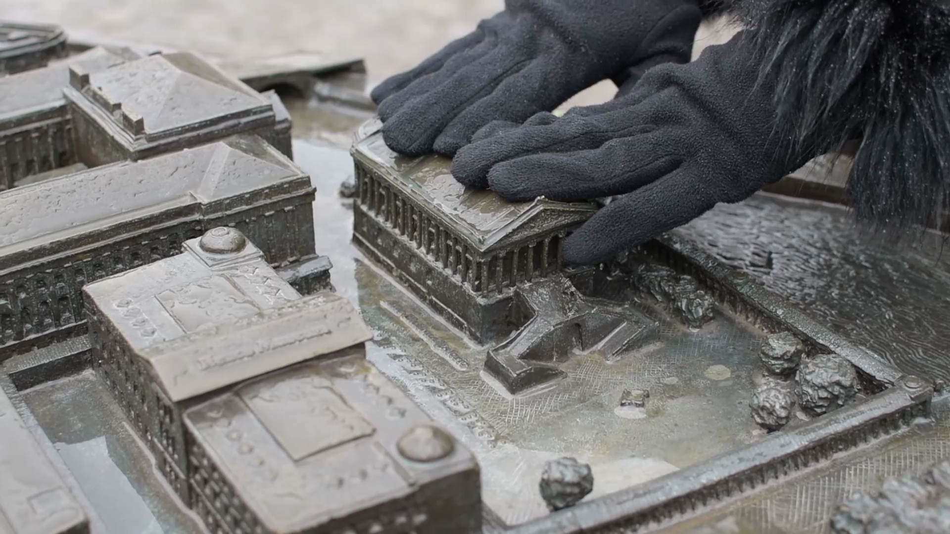
When you visit Berlin, one of the biggest stops on the tourist circuit is the Pergamon Museum. It’s Germany’s most touristed museum, with 1 million visitors per year! But if you go today—and for the next few years—you can visit not just one but TWO Pergamon Museums. While the historic museum building is being renovated and expanded (it was never fully renovated after being bombed in the Second World War, and didn’t even have a climate control system!) there is an interim Pergamon exhibition being shown in a new building across the street. This new building is confusingly called “Pergamon Museum. The Panorama.” This exhibition includes a Panorama by the artist Yadegar Asisi, as well as an eye-popping display of ancient art from the Greek city of Pergamon. So with one ticket, you can go into two buildings to see some spectacular stuff!
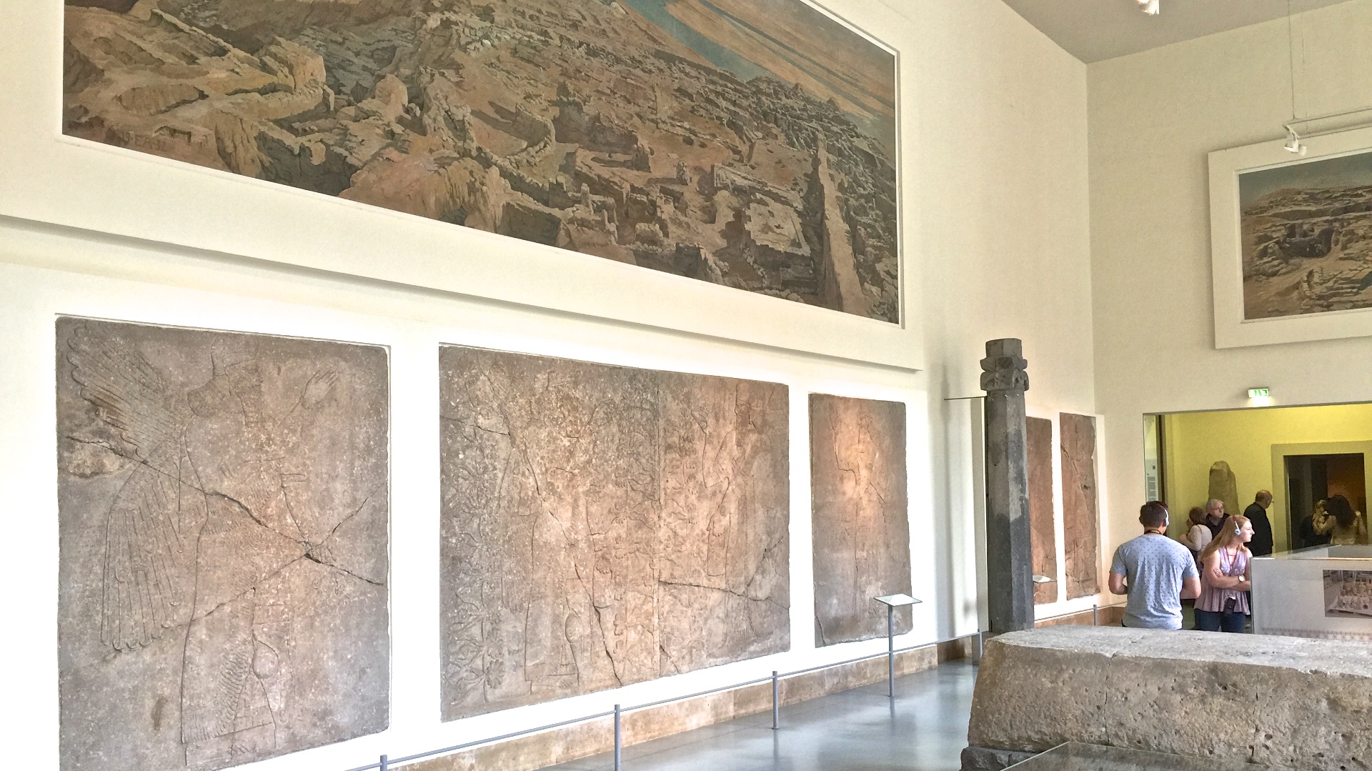
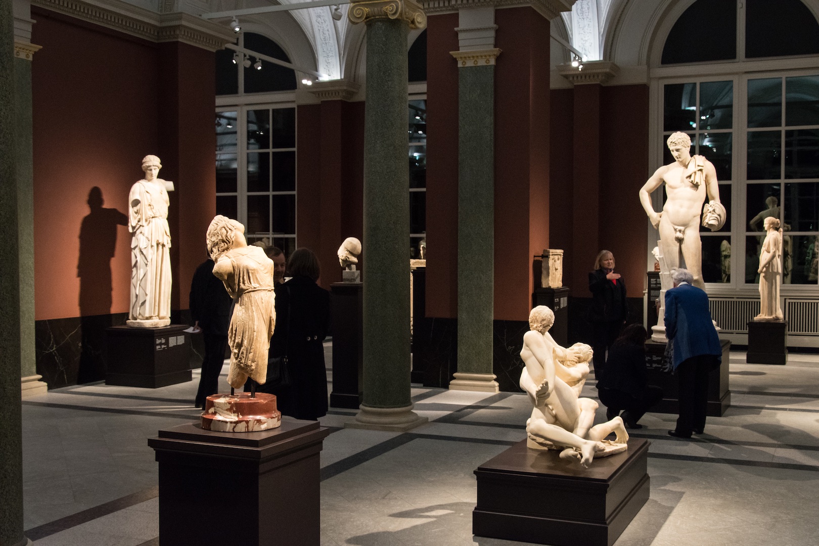
The two buildings house very different presentations, so seeing both of them gives you a look into the spectrum of possible museum display styles. The historic building (entered through the James-Simon-Galerie; see our video for tips!) houses a traditional display of the objects. Check out the photo below: neutral-colored walls, text on white paper labels, and some historic murals of the archaeological sites painted by the wife of the excavator. The objects may be fabulous—my favorite hidden gem is the subject of the next video—but the display is neutral.
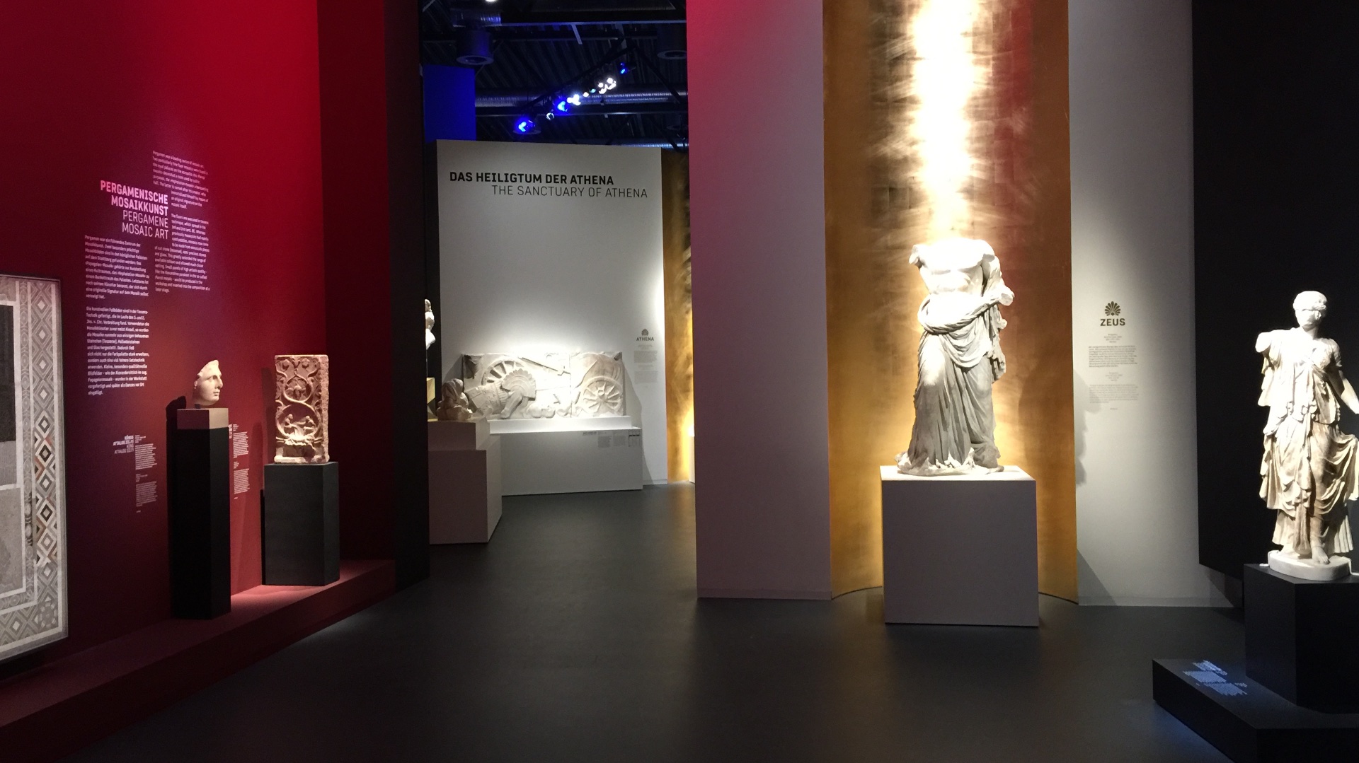
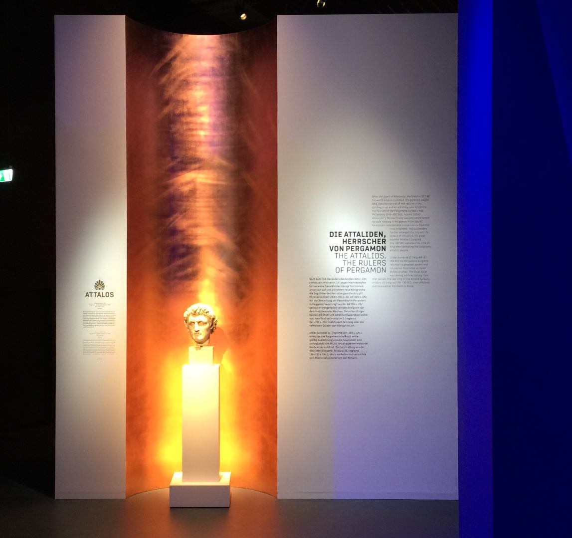
In contrast, the Asisi display is theatrical! See the photo below: brightly-colored walls and lights, gilded surfaces, black floors and ceilings. The objects pop out like actors on a stage.
See much, much more in our video, and others on our YouTube channel: Click here
You visited these museums too? Leave a review! Click here for the new show with the Panorama, or here for the historic building.
What's on Berlin's Museum Island? Our new Video!
Not even icy rain could keep us away… although it did result in some hilarious outtakes! We just had to make this new video for you. You know that Berlin’s Museum Island is the tourist center of the city, but do you know which museum houses which collections? And how the museums can be understood as a product of their time? Our short intro clues you into the big picture. Upcoming videos will show you the individual museums, as well as some pro tips for visiting them. Check it out! Click here
Explore even more on our YouTube channel: Click here
Did you know that the Pergamon Museum is temporarily split across two buildings? Confusing. We’ll tell you more in a video. For now, see our pages on the historical museum (click here) and the new interim building with a special exhibition (click here).
Opening Night for Dresden's Sculpture and Painting
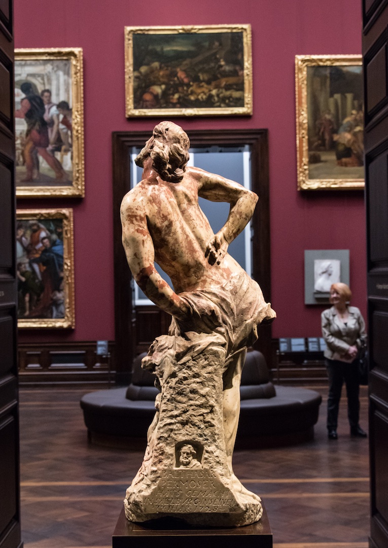
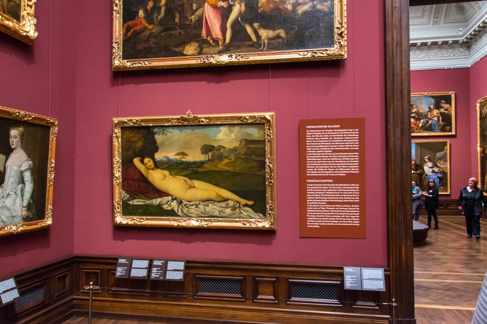
With plenty of fanfare—speeches by bigwigs, a live-streamed concert on a huge screen, and a line around the block—the Dresden Sculpture Collection and Old Masters Picture Gallery opened on Friday after 7 long years of renovation. Quite a celebration; of course we didn’t want to miss it!
Loaded up with camera equipment and special entry cards (our VIP dreams come true…but why are we still lugging our own equipment??) we stalked the galleries documenting the displays. Not to mention having a lot of fun in the festive atmosphere! There’s no better see-and-be-seen crowd than Museum Lovers, amiright? Feathery jackets, plastic pants, and enough fabulous jewelry to be an exhibition in itself!
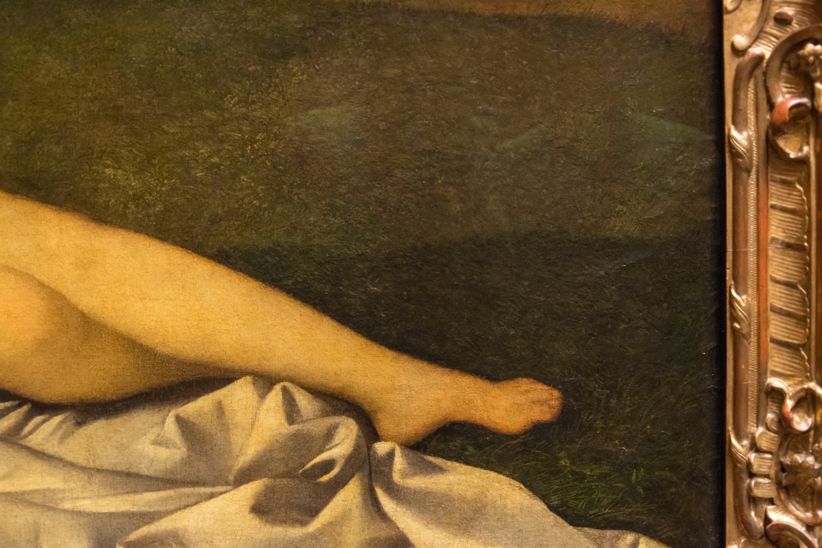
Guides were stationed in some of the rooms to talk with the visitors, a great touch. One of them clued us into a secret about the ultrafamous Giorgione painting of Venus: X-rays have revealed that a little Cupid used to be beside her feet, where now there is just grass (see photo). I wish that were in the museum label—it’s such a cool tidbit.
Check out our video about the opening night and these collections: they are truly beautiful, and we’re just pleased as punch to be able to show you!
Watch this video and others on our YouTube channel: Click here
You visited this museum too? Leave a review! Click here
Exhibition Love at the Bode Museum
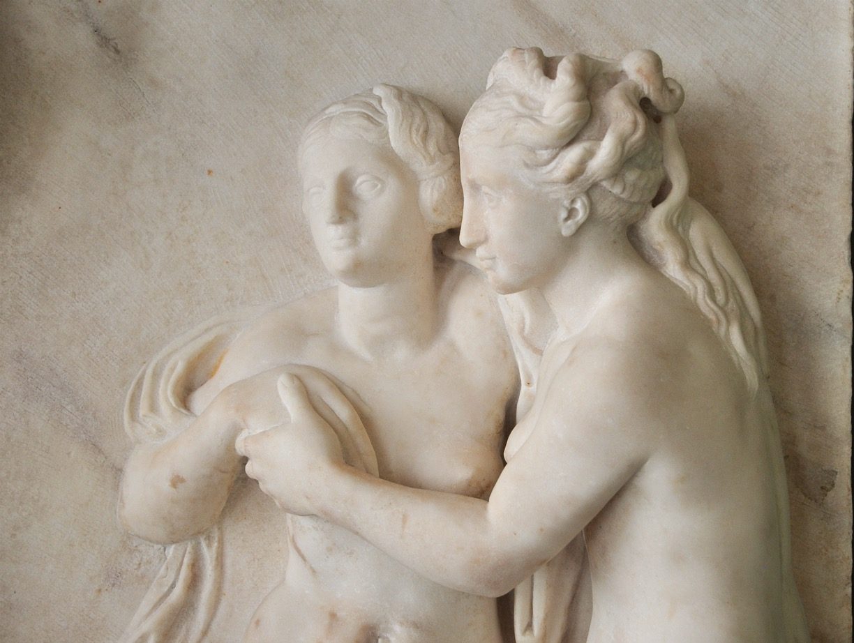
That crazy little thing called love is now in the spotlight at Berlin’s Bode Museum – and not just in the galleries! For museums.love, of course, the choice of love for an exhibition already gets five stars. But more than that, it’s wonderful to see how the theme of the show extends beyond the museum walls to embrace the community. Under the title “The Second Glance: All Forms of Love”, the exhibition aims to expand the view of love to include forms that have been marginalized in traditional Western art history. Smart to organize this show together with the Schwules Museum, Berlin’s LBGTQ* museum! With five paths through the permanent collection, the visitor can choose which theme to explore:
1. In Love and War (masculinity and bisexuality among soldiers)
2. Male Artists and Homosexuality (artists active in homosexual circles)
3. Art of Antiquity and Enlightened Collecting (homosexual collectors)
4. Heroines of Virtue (female intimacy and erotic love)
5. Crossing Borders (gender fluidity)
Not only is the museum seizing the chance to tell important, diverse new stories with its objects, but it is enriching the offerings with a lecture series (the next talk is next week!). I imagine that other types of events too could have appealed to the newer, more diverse audiences being addressed – like performing art shows and new kinds of participatory tours! But of course there is only so much one can do, and the show is already an enormous step into the 21st-century idea that museums exist for their communities. A free object catalog online increases access to the project, as well as a glossary and bibliography for the eager beavers among us. Hosting the lab.bode visitor engagement workshops as well, the Bode Museum is truly the community champion of Museum Island!
Visiting Exhibitions Online
Armchair travelers rejoice! More and more museums are putting not only their collections online, but even actual exhibitions. Online collections and online exhibitions have some points in common, but also some crucial differences. Both can allow the visitor to zoom in on a high-resolution photo of an object for a closer look. And both resources offer at least some information about the objects. But an online exhibition does more. It highlights a few objects in the context of a certain theme, and thus offers a more cohesive look into a moment in history through the objects. Placing the objects into a frame like this – associating them with other objects and describing them in focused texts – is a great way to tell a compelling story. What is more, online exhibitions can allow the visitor to move through a virtual space in line with their own interests. And sometimes they connect with exhibitions in the physical world – a chance to see some of the objects in person.
Here are some fabulous online exhibitions – just a click away!
Bauhaus: Building the New Artist – The Getty Research Institute https://www.getty.edu/research/exhibitions_events/exhibitions/bauhaus/new_artist/
Rembrandt in Southern California – Hammer Museum, The J. Paul Getty Museum, LACMA, Norton Simon Museum, Timken Museum of Art https://rembrandtinsocal.org/virtual-exhibition/
Vermeer, Kawakubo, Coco Chanel and 24 more exhibitions by The Met Museum and Google Arts & Culture https://artsandculture.google.com/partner/the-metropolitan-museum-of-art
Virtual tour of the permanent collection – Bode-Museum http://bode360.smb.museum
O Sentimental Machine – Liebighaus Skulpturensammlung https://kentridge.liebieghaus.de/en/william-kentridge-o-sentimental-machine
Requiem for the Currywurst Museum
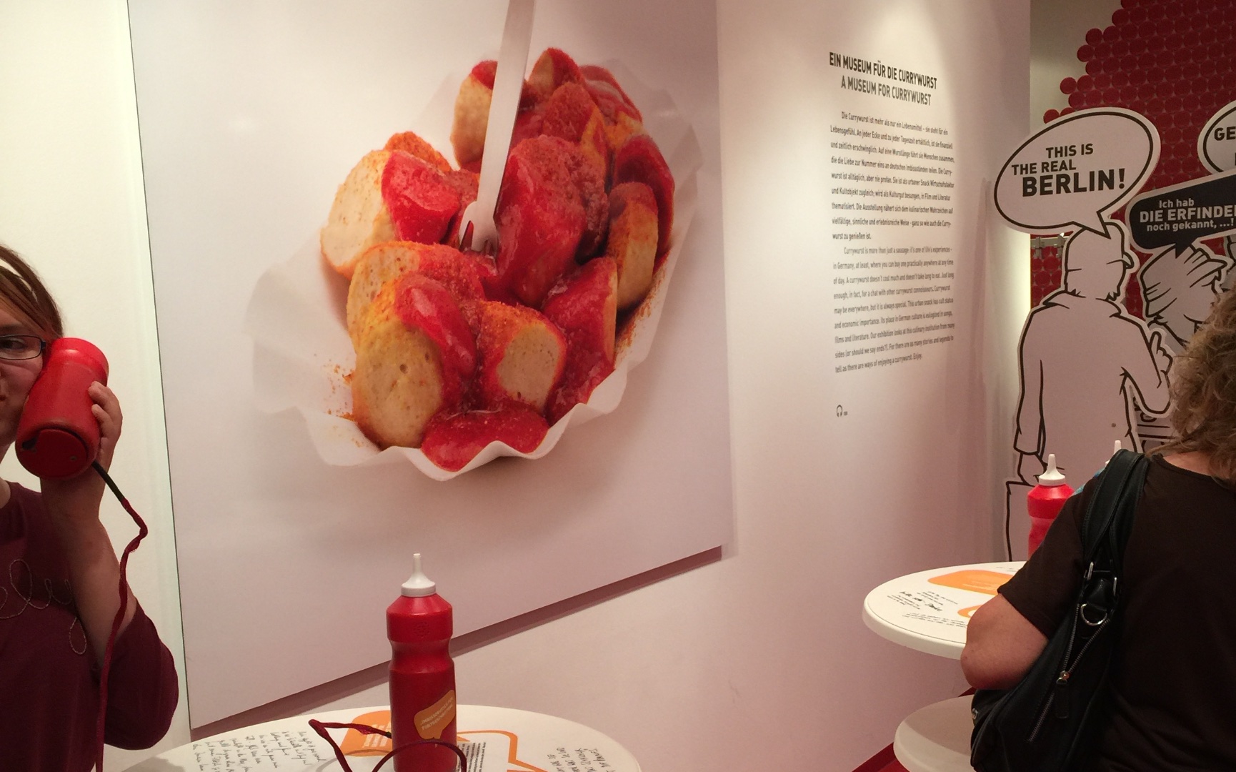
One of the most interactive, kid-friendly museums in Berlin tragically closed its doors one year ago: the Currywurst Museum. This is a requium for one of my favorite local museums. While the topic of the museum sounds almost like a joke—a museum dedicated to a hot dog smothered with ketchup and dusted with curry powder??—the display was genius. Sniff, peek, listen, pry, taste; visitors were encouraged to explore using all their senses, hardly noticing that they were also learning the surprisingly enthralling social history of the currywurst. Invented in Berlin and since then consumed in enormous quantity, the snack has indeed become symbolic. But currywurst is far more than a kitschy icon. Its birth was rooted in social conditions in Berlin in the 1950s, when many workers needed quick and cheap food on the go. The museum told this story in part using enlarged historical photos and text panels like speech bubbles (see pictures below). It also included a spice room, in which a whole wall was covered with colored panels with the names of curry spices on them; some panels were actually drawers to be opened to learn more. In the center of the room were five waist-high poles with lids for visitors to open (beckoned by a question mark), take a sniff, and guess what the spices were. Both these and the spice drawers were low to the ground, allowing kids to get in on the action! On one side of the room were tall wooden planks with questions written on one side, answers on the other, waiting for your hand to turn them. They focused on the ruffled paper plate that currywurst is almost always served on (hence the wooden material of the exhibit): is it environmentally friendly? Why not use normal dishes? What happens to the paper plate after it’s tossed out?
Finally, in the entrance/exit area were several white bar tables like those set up at currywurst stands. The ketchup bottles on each were actually audio sets you could put to your ear like a phone and hear stories from! On the table surfaces, text in a handwritten style like graffiti told you how currywurst is traditionally ordered by Berliners: you never say “currywursts” in the plural, and you only order the kind without skin! All in all, this museum was made with a lot of creativity and love. Rightly so for a food now competing for protected origin status! While the museum was apparently planned from the beginning to be temporary, I nonetheless mourn its passing acutely. Hopefully its rumored revival as a traveling special exhibition will retain some of its former glory.
Art for people! A positive perspective on the MoMA rehang
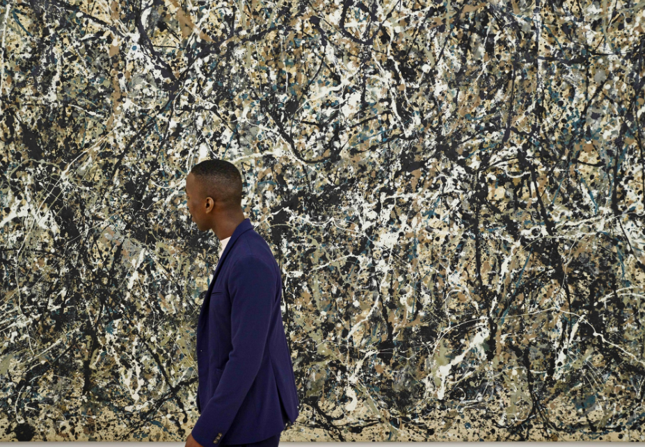
The Museum of Modern Art in New York recently reopened its doors after having shuffled around the entire display of its permanent collection. Many negative reactions have been published since then by culture critics and museum experts. Yet for all that this “rehang” presents some problems, it also offers some solutions to long-standing problems. I’d like to present a more positive evaluation of the rehang, which seems to me to be lacking in the discussion so far. It’s worth taking a step back to look at both the rehang and the reactions to it in terms of the museum’s mission. As published on its website, MoMA’s mission aims to uphold a responsibility to two parties: the art and the public. “In sum, The Museum of Modern Art seeks to create a dialogue between the established and the experimental, the past and the present, in an environment that is responsive to the issues of modern and contemporary art, while being accessible to a public that ranges from scholars to young children.” The two stakeholders here are the art (the basis of the “dialogue”) and a wide range of visitors. Is this present in the new display? Is the mission statement the guiding light for this major shift, as a good mission statement should be? I would argue that it is. The generally negative reactions to the rehang arise, I think, from an idea that MoMA’s many, many visitors should get to see what they want: the blockbusters. This is evident in the complaints that a favorite painting is no longer on show, or blockbuster paintings like Van Gogh’s Starry Night are still on show but placed in a less central location. But if that is a loss – and it is! people will always want to see their favorite painting – it is countered by a big gain. A really big gain, to my mind. Namely: the rehang is actively redefining art. Because MoMA is, ultimately, a tastemaker. No, much more than a tastemaker: MoMA defines what art is. If MoMA only showed Picasso, Mondrian, and Van Gogh, many people in the world could rightly gain the impression that only these three men made modern art, period. Not in the museum? Not art! So, in expanding its display to include more women artists, more Latinx artists, more artists of any tradition beyond the white European male one, MoMA is expanding the definition of modern art. At the expense, admittedly, of some of our favorite white male European artists. This is a loss, but an acceptable one, when we consider the concomitant gain. Indeed, the gain of this is so huge it is difficult to express. It is colossal!! Visitors will see new things, see art made by grandmothers and Nigerians and so many other people who might even be more like them, who might even open their minds to the idea of making art themselves, or even better, to the realization that they are the kind of person who can also make an object that other people flock to look at, they can also touch lives, they can make a difference, they can make history. Maybe they won’t see that one iconic Matisse they had bookmarked on Instagram, but they will see so much more! Even if under duress… And to my mind, this is part of MoMA’s job as a good citizen of the world. MoMA is a huge, culture-making institution. It can afford to disappoint a few people just a tiny bit – we all wish it didn’t have to be so! – if the bigger effect is to change the way we see art. And the way art affects us as people. In my heart of hearts, I believe that this change is worth it: a change that empowers wildly diverse people in all sorts of ways that just might change the world.

